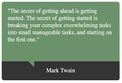
I came across a site that displayed a quote in a box, you know, the one with a little triangle thing at the bottom to indicate dialog or something. I've never worked on a project that required me to style a quote in this way, so I was curious to know how to create one. Here's a preview of what I came up with:

HTML
First, I needed some markup to set the whole thing up. I wrapped everything in a container class just to control the size for this demo:
<div class="container">

</div>
Then I added a wrapper class for the quote, I called it quote-box:
<div class="container">
    <div class="quote-box">

    </div>
</div>
And then the actual quote split in two areas, quote text and name, styled by the classes quote and name respectively:
<div class="container">
    <div class="quote-box">
        <div class="quote">
            <blockquote>
                "The secret of getting ahead is getting started. The secret of getting started is breaking your complex overwhelming tasks into small manageable tasks, and starting on the first one."
            </blockquote>
        </div>
        <div class="name">
            Mark Twain
        </div>
    </div>
</div>
CSS
I applied some styling to the quote text and the name:
/* Contain demo size */
.container {
    width: 400px;
}

.quote {
    background-color: #6b936a;
    border-top-left-radius: 8px;
    border-top-right-radius: 8px;
    color: #fff;
    margin: 0;
    padding: 20px;
    font-size: 20px;
}

.name {
    background-color: #333;
    border-bottom-left-radius: 8px;
    border-bottom-right-radius: 8px;
    color: #fff;
    font-size: 20px;
    padding: 20px;
    text-align: center;
}

/* Reset */
blockquote {
    padding: 0;
    margin: 0;
}
Nothing special so far. Here's what will transform this box into a "quote" box. The following CSS creates a triangle looking thing by taking advantage of the way borders behave. I do that by creating an element after the quote that has no width or height but has a thick border. Styling the border color strategically creates a triangle. Then I positioned half of this triangle just below the quote and done! The position is relative so it can "move" with the box for responsiveness:
blockquote::after {
    border-color: transparent #6b936a transparent transparent;
    border-image: none;
    border-style: solid;
    border-width: 20px;
    top: 40px;
    content: " ";
    display: block;
    right: 75%;
    position: relative;
}
Here's the whole thing put together. Feel free to change it around and make it yours.
Happy coding!