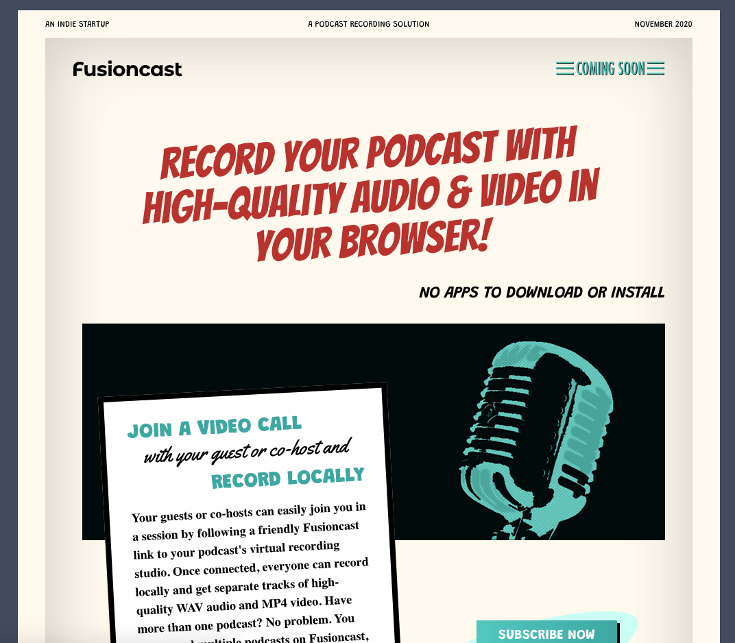
That's the old landing page ☝️
I've began working on a new marketing website for Fusioncast. The design of the old landing page, was inspired by the advertising style of the 1950's (the "golden age of radio"). That style is characterized by the heavy use of over-the-top typography and large, dense blocks of text. Mimicking that in todays web is problematic, so I've decided to move on from that, to a much simpler, modern look. I still want it to be different, original. So let's see if I can come up with some simple but wacky design. Planning to design "in-browser" as I go, using TailwindCSS on Statamic.